An optional touchscreen keyboard can be displayed at the start or end of the photo booth shooting sequence to allow users to enter information such as their email address. To enable the keyboard set the photo booth start options in the photo booth settings dialog to "Touchscreen" and click on the "Settings..." button. The touchscreen settings dialog will be displayed:
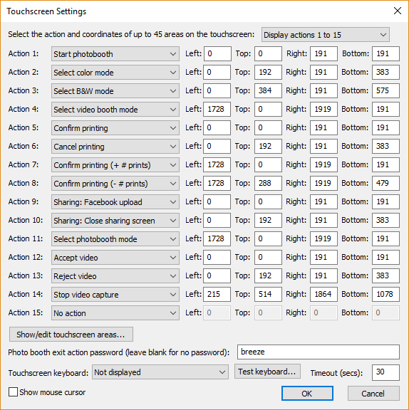
Then select the required touchscreen keyboard option from the dropdown list:
"Not displayed" - the touchscreen keyboard is not displayed
"Email input at start of sequence" - the email input touchscreen keyboard is displayed when the user presses the start button before any of the photos are taken
"Email input at end of sequence" - the email input touchscreen keyboard is displayed after the photos have been taken and the optional print confirmation screen has been displayed (it isn't displayed if the user chooses not to print the photos)
"Email input after taking photos".- the email input touchscreen keyboard is displayed immediately after taking the photos before the optional print confirmation screen
"Message input at end of sequence" - the message input touchscreen keyboard is displayed after the photos have been taken and the optional print confirmation screen has been displayed (it isn't displayed if the user chooses not to print the photos)
The "Timeout (secs):" setting allows an inactivity timeout to be specified. If the user does not tap the touchscreen for a while the timeout will automatically close the touchscreen keyboard. This is useful if the user leaves the photo booth without using the touchscreen keyboard as it allows the booth to automatically close the touchscreen keyboard and display the ready screen ready for the next user.
The touchscreen keyboard can be tested by pressing the "Test keyboard..." button and selecting the keyboard to test. The default keyboard layout will fill the screen and look similar to the screenshot below:
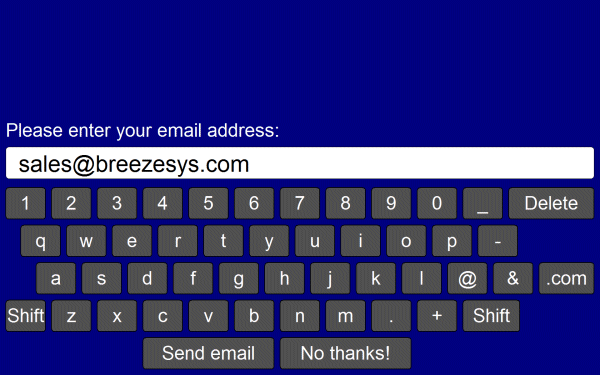
The keyboard used for entering the user's email address when using the email option can be displayed by clicking on the "Test keyboard..." button and selecting "email keyboard...".
The text entered by the user is saved in the <user_data> tag (and the <user2_data> tag if two text fields are defined) in the XML file written at the end of the photo booth shooting sequence. If any checkboxes are defined (see below) their status will be saved in <chkbox1>, <chkbox2> etc. tags e.g. if the user selects the first checkbox the XML will contain <chkbox1>1</chkbox1>. The XML file is saved in the same folder as the photos downloaded from the camera (see photobooth setup) e.g.
<?xml version="1.0" ?>
<breeze_systems_photobooth version="1.0">
<photo_information>
<date>2011/01/26</date>
<time>16:37:19</time>
<user_data>sales@breezesys.com</user_data>
<photobooth_images_folder>C:\Photobooth\PhotoboothImages</photobooth_images_folder>
<photos>
<photo image="1">20110126_163719.JPG</photo>
<photo image="2">20110126_163724.JPG</photo>
<photo image="3">20110126_163729.JPG</photo>
<photo image="4">20110126_163734.JPG</photo>
<output>prints\20110126_163719.jpg</output>
</photos>
</photo_information>
</breeze_systems_photobooth>
There is a default timeout of 300 secs after which time the touchscreen keyboard will be automatically canceled. This timeout is stored in the Windows registry key:
HKEY_CURRENT_USER\Software\BreezeSystems\WebcamPhotobooth\102\PhotoboothKeyboardTimeout
Customizing the keyboard
The layout of the keyboard can be customized by creating an XML settings file called keyboard.xml and putting this in the photo booth images folder. This gives control over the size and position of the keys, the background color etc. A series of keyboard images can also be used if you need more control of the appearance of the keyboard.
The easiest way to customize the keyboard is to save a copy of the XML file and TIFF screen images used to define the default keyboard layout and then edit them as required. The files can be saved by first displaying the keyboard by pressing the "Test keyboard..." button and then holding down both the Shift and Ctrl keys and pressing the left mouse button. The keyboard.xml file will look something like:
<?xml version="1.0" ?>
<breeze_systems_photobooth version="2.2">
<photobooth_settings>
<keyboard>
<text_point_size>480</text_point_size>
<prompt1>Please enter your email address:</prompt1>
<text1_y>411</text1_y>
<text1_x>50</text1_x>
<text1_r>300</text1_r>
<background_color>0x000080</background_color>
<transparent_color>0x000080</transparent_color>
<text_color>0xFFFFFF</text_color>
<show_cursor>0</show_cursor>
<show_mouse_cursor>0</show_mouse_cursor>
<key>
<left>58</left>
<top>630</top>
<width>112</width>
<height>89</height>
<legend>q</legend>
<shifted_legend>Q</shifted_legend>
<code>q</code>
<shifted_code>Q</shifted_code>
</key>
<key>
<left>186</left>
<top>630</top>
<width>112</width>
<height>89</height>
<legend>w</legend>
<shifted_legend>W</shifted_legend>
<code>w</code>
</key>
...
<key>
<left>1296</left>
<top>840</top>
<width>160</width>
<height>89</height>
<legend>Shift</legend>
<shifted_legend>Shift</shifted_legend>
<code>Shift</code>
<shifted_code>Shift</shifted_code>
</key>
<key>
<left>400</left>
<top>945</top>
<width>368</width>
<height>89</height>
<legend>Send email</legend>
<shifted_legend>Send email</shifted_legend>
<code>OK</code>
<shifted_code>OK</shifted_code>
</key>
<key>
<left>784</left>
<top>945</top>
<width>368</width>
<height>89</height>
<legend>No thanks!</legend>
<shifted_legend>No thanks!</shifted_legend>
<code>Cancel</code>
<shifted_code>Cancel</shifted_code>
</key>
</keyboard>
</photobooth_settings>
</breeze_systems_photobooth>
The <prompt1> tag defines the text that is displayed above the user input area and defaults to "Please enter your email address:". The <text1_x> and <text1_y> tags specify the position of the user input area. This is specified as the number of pixels down from the top, left corner of the screen. The right hand side of the user input area can be specified using the <text1_r> tag.
Additional prompts can be added by including <prompt2>, <text2_x>, <text2_y>, <text2_r> etc. tags up to a maximum of 10 user input areas.
The prompt tags can have an optional password attribute which if set to "1" will display the text in the user input area as * characters e.g. <prompt1 password="1">Please enter your password:</prompt1>.
The prompt tags can have an optional mandatory attribute which if set to "1" means that the prompt must contain text e.g. <prompt1 mandatory="1">Please enter your name:</prompt1>.
The prompt tags can have an optional email_address attribute which if set to "1" will check that the text looks like an email address in the form name@domain.com e.g. <prompt1 email_address="1">Please enter your email address:</prompt1>. If the text does not appear to be an email address an error message saying "Please enter a valid email address in the form name@domain.com" will be displayed. The text of this error message can be changed in the email settings dialog.
The input text area is normally on a single line. Multiple lines can be used by setting the prompt tag's rows attribute to 2 or more e.g. <prompt1 rows="3">Please enter a message:</prompt1>.
When more than one user input area is defined users can switch between the input areas by touching them. The currently selected input area is highlighted in red.
The optional <text_point_size> tag defines the size of the text font used in the user input area. This is specified in tenths of a point and defaults to 480 (a point size of 48).
The text entered by the user is stored in the <user_data>, <user2_data> etc. fields in the XML file saved with the photos.
Up to 10 checkboxes can be added using the <chkbox1_prompt>, <chkbox1_x>, <chkbox1_y>, <chkbox2_prompt>, <chkbox2_x>, <chkbox2_y> etc. tags. The <chkbox1_prompt> tag specifies the text displayed to the right of the text box and can include a value attribute to specify whether the checkbox is initially checked or not e.g. <chkbox1_prompt value="0">Checkbox prompt (default off)</chkbox1_prompt> or <chkbox1_prompt value="1">Checkbox prompt (default on)</chkbox1_prompt>. A checkbox can also be made mandatory (i.e. the user has to check the checkbox before pressing the "OK" button) by adding the mandatory attribute to the <chkbox1_prompt> tag e.g. <chkbox1_prompt mandatory="1">I agree to the terms and conditions</chkbox1_prompt>.
The <chkbox1_x> and <chkbox2_y> tags specify the position of the checkbox.
The checkbox status is stored in the <chkbox1>, <chkbox2> etc. fields in the XML file saved with the photos.
The <background_color> tag specifies the background color of the window and the <key_text_color> specifies the color for the prompt text and key legends.
The optional <text_foreground_color> tag specifies the foreground color for text displayed in the user input areas. The default value if this tag is omitted is black (0x000000).
The optional <text_background_color> tag specifies the background color for the user input areas. The default value if this tag is omitted is white (0xFFFFFF).
The optional <transparent_color> tag specifies a color which will be made transparent when the keyboard is displayed.
All colors should be hexadecimal RGB values e.g. 0x000000 for black, 0xFF0000 for red, 0x00FF00 for green, 0x0000FF for blue, 0xFFFFFF for white.
The <show_cursor> tag specifies whether a gray cursor is shown in the user input area. Set this to 1 to display the cursor or 0 to hide it. The cursor display is useful if the keyboard allows the entry of spaces.
The <show_mouse_cursor> tag specifies whether a the mouse cursor is displayed, The default setting is for the mouse cursor not to be displayed.
The <key> tag specifies the size and position of each key, its legends and what should be typed when it is pressed. The top left corner of the key is defined using the <left> and <top> tags and the width and height are specified using the <width> and <height> tags (all values are in pixels). The <shifted_legend> tag specifies what is displayed on the key when the shift key is pressed and the <legend> specifies the key legend when shift is not pressed.
The <shifted_code> tag specifies what is typed when the key is pressed when shift is pressed and the <code> tag specifies what is typed when the shift key is not pressed. The following codes have special values:
"Shift" - puts the keyboard into shifted mode (i.e. upper case) when pressed
"OK" - closes the keyboard window and returns the user input if at least one text input field contains text
"OK all" - closes the keyboard window and returns the user input if all the input fields contain some text
"OK none" - closes the keyboard window and returns the user input even if none of the input fields contain text
"Cancel" - closes the keyboard window and cancels the user input
International and special characters need to be added in UTF-8 unicode format e.g. the Euro symbol, , is defined in UTF-8 as 0x20AC. This needs to added to the XML file as € e.g.
<key>
<left>58</left>
<top>630</top>
<width>112</width>
<height>89</height>
<legend>&#&x20ac;</legend>
<shifted_legend>&#&x20ac;</shifted_legend>
<code>&#&x20ac;</code>
<shifted_code>&#&x20ac;</shifted_code>
</key>
The keyboard.xml can just include additional settings and the touchscreen keyboard will use the default layout (shown above) if it doesn't contain any <key> tags. For example you could use the default keyboard layout and add a checkbox to ask users whether they consent to their photos being uploaded to a website using the keyboard.xml file below:
<?xml version="1.0" ?>
<breeze_systems_photobooth version="2.3">
<photobooth_settings>
<keyboard>
<chkbox1_prompt value="0">I agree to my photos being posted on a web site</chkbox1_prompt>
<chkbox1_x>38</chkbox1_x>
<chkbox1_y>70</chkbox1_y>
</keyboard>
</photobooth_settings>
</breeze_systems_photobooth>
Keyboard images
Separate keyboard screen images can be defined if you need more control over the appearance of the keyboard. These images should be TIFF images the same size as the resolution of the screen and should be placed in the photo booth images folder. The keyboard images should be named as follows:
keyboard_uppercase.tif - keyboard image showing upper case key legends
keyboard_uppercase_pressed.tif - keyboard image showing upper case key legends with the keys pressed
keyboard_lowercase.tif - keyboard image showing lower case key legends
keyboard_lowercase_pressed.tif - keyboard image showing lower case key legends with the keys pressed
If TIFF keyboard images aren't found the software will attempt to load JPEG images instead (keyboard_uppercase.jpg, keyboard_uppercase_pressed.jpg, keyboard_lowercase.jpg and keyboard_lowercase_pressed.jpg).
When the email option is used (see Uploading to social networks...) the touchscreen keyboard will look for the following keyboard xml definition file and keyboard images:
email_keyboard.xml - XML file defining the keyboard layout
email_keyboard_uppercase.tif - keyboard image showing upper case key legends
email_keyboard_uppercase_pressed.tif - keyboard image showing upper case key legends with the keys pressed
email_keyboard_lowercase.tif - keyboard image showing lower case key legends
email_keyboard_lowercase_pressed.tif - keyboard image showing lower case key legends with the keys pressed
Please note that for compatibility with previous releases the email option will use the standard XML definition file and keyboard images if versions with an email_ prefix aren't found.
When the Twitter upload option is used (see Uploading to social networks...) the touchscreen keyboard will look for the following keyboard xml definition file and keyboard images:
twitter_keyboard.xml - XML file defining the keyboard layout
twitter_keyboard_uppercase.tif - keyboard image showing upper case key legends
twitter_keyboard_uppercase_pressed.tif - keyboard image showing upper case key legends with the keys pressed
twitter_keyboard_lowercase.tif - keyboard image showing lower case key legends
twitter_keyboard_lowercase_pressed.tif - keyboard image showing lower case key legends with the keys pressed
When the send SMS/MMS option is used (see Uploading to social networks...) the touchscreen keyboard will look for the following keyboard xml definition file and keyboard images:
mms_keyboard.xml - XML file defining the keyboard layout
mms_keyboard_uppercase.tif - keyboard image showing upper case key legends
mms_keyboard_uppercase_pressed.tif - keyboard image showing upper case key legends with the keys pressed
mms_keyboard_lowercase.tif - keyboard image showing lower case key legends
mms_keyboard_lowercase_pressed.tif - keyboard image showing lower case key legends with the keys pressed
When the "Message input at end of sequence" option is used the touchscreen keyboard will look for the following keyboard xml definition file and keyboard images:
message_keyboard.xml - XML file defining the keyboard layout
message_keyboard_uppercase.tif - keyboard image showing upper case key legends
message_keyboard_uppercase_pressed.tif - keyboard image showing upper case key legends with the keys pressed
message_keyboard_lowercase.tif - keyboard image showing lower case key legends
message_keyboard_lowercase_pressed.tif - keyboard image showing lower case key legends with the keys pressed
Please take care that the keys are in the same positions in each of the keyboard images and that these also correspond to the values in the keyboard.xml file. The <background_color>, <text_color>, <prompt>, <legend> and <shifted_legend> tags in the keyboard.xml file are ignored when keyboard images are used to define the appearance of the keyboard.
Note: If you only need to change the keyboard layout and are happy with the default keyboard display you only need to create a keyboard.xml file in the photo booth images folder and can delete the keyboard screen images (keyboard_uppercase.tif, keyboard_uppercase_pressed.tif, keyboard_lowercase.tif and keyboard_lowercase_pressed.tif). If keyboard images are defined the <prompt> tags in the keyboard.xml file will be ignored.